Avevo già parlato in qualche articolo delle numerose potenzialità del CSS3 e di come fare delle animazioni in CSS3 , oggi vediamo come scrivere il codice per creare un conto alla rovescia (countdown) da mettere sul sito.

Per realizzare il countdown abbiamo bisogno anche di jQuery, la libreria Javascript che possiamo richiamare direttamente dalla CDN, nel mio caso da Cloudflare
|
1 |
<script src='http://cdnjs.cloudflare.com/ajax/libs/jquery/2.1.3/jquery.min.js'></script> |
Scriviamo il codice HTML
|
1 2 3 4 5 6 7 8 9 10 11 12 |
<h1> Mancano <div class="counter"> <span class="decor top"></span> <span class="decor bottom"></span> <span class="from top"><span></span><span class="shadow"></span></span> <span class="from bottom"><span></span><span class="shadow"></span></span> <span class="to top"><span></span><span class="shadow"></span></span> <span class="to bottom"><span></span><span class="shadow"></span></span> </div> secondi al minuto. </h1> |
Ed il codice JS che regola il conto alla rovescia
|
1 2 3 4 5 6 7 8 9 10 11 12 13 14 15 16 17 18 19 20 21 22 23 24 25 26 27 28 29 30 31 32 33 34 35 |
calcValues(); var int = setInterval(calcValues, 1000); function calcValues() { $('.counter .to') .addClass('hide') .removeClass('to') .addClass('from') .removeClass('hide') .addClass('n') .find('span:not(.shadow)').each(function (i, el) { $(el).text(getSec(true)); }); $('.counter .from:not(.n)') .addClass('hide') .addClass('to') .removeClass('from') .removeClass('hide') .find('span:not(.shadow)').each(function (i, el) { $(el).text(getSec(false)); }); $('.counter .n').removeClass('n'); } function getSec(next) { var d = new Date(); var sec = 60-d.getSeconds(); if (next) { sec--; if (sec < 0) { sec = 59; } } else if(sec == 60) { sec = 0; } return (sec < 10 ? '0' + sec : sec); } |
Ed infine il CSS3
|
1 2 3 4 5 6 7 8 9 10 11 12 13 14 15 16 17 18 19 20 21 22 23 24 25 26 27 28 29 30 31 32 33 34 35 36 37 38 39 40 41 42 43 44 45 46 47 48 49 50 51 52 53 54 55 56 57 58 59 60 61 62 63 64 65 66 67 68 69 70 71 72 73 74 75 76 77 78 79 80 81 82 83 84 85 86 87 88 89 90 91 92 93 94 95 96 97 98 99 100 101 102 103 104 105 106 107 108 109 110 111 112 113 114 115 116 117 118 119 120 121 122 123 124 125 126 127 128 129 130 131 132 133 134 135 136 137 138 139 140 141 142 143 144 145 146 147 148 |
@import url(http://fonts.googleapis.com/css?family=Roboto+Condensed:300|Oswald); body, html { width:100%; height:100%; margin:0; padding:0; } body { background: #555555; background-image: -webkit-radial-gradient(cover, #f1f1f1, #cbcbcb); background-image: -moz-radial-gradient(cover, #f1f1f1, #cbcbcb); background-image: -o-radial-gradient(cover, #f1f1f1, #cbcbcb); background-image: radial-gradient(cover, #f1f1f1, #cbcbcb); } h1 { font-family:'Roboto Condensed', cursive; text-align:center; line-height:100px; font-size:28px; font-weight:normal; position:absolute; top:50%; left:50%; margin:-50px 0 0 -300px; width:600px; color:#939393; } h1 .counter { font-size:50px; width:80px; height:50px; font-family:'Oswald', sans-serif; display:inline-block; padding:0 30px 0 10px; perspective: 200px; position:relative; top:-7px; } h1 .counter > span { display:block; position:absolute; overflow:hidden; padding:0 25px; background:-webkit-gradient(linear, 0 0, 0 100%, from(#FFF), to(#f2f2f2)); background:-webkit-linear-gradient(#FFF 0%, #f2f2f2 100%); background:-moz-linear-gradient(#FFF 0%, #f2f2f2 100%); background:-o-linear-gradient(#FFF 0%, #f2f2f2 100%); background:linear-gradient(#FFF 0%, #f2f2f2 100%); height:45px; width:50px; text-align:center; backface-visibility:hidden; transform-style: preserve-3d; } h1 .counter > span span { color:#99df1c; } h1 .counter > span.decor.top { box-shadow: 0 24px 43px -3px rgba(0, 0, 0, 0.45); } h1 .counter > span.decor.bottom { box-shadow: 0 2px 0px -1px #d8d8d8, 0 4px 0px -2px #c7c7c7, 0 6px 0px -3px #d8d8d8, 0 8px 0px -4px #c6c6c6, 0 10px 0px -5px #d6d6d6, 0 12px 0px -6px #c9c9c9, 0 14px 0px -7px #d8d8d8, 0 14px 23px -9px rgba(0, 0, 0, 0.8); } h1 .counter > span.top { box-shadow: inset 0 -1px 3px rgba(0, 0, 0, 0.2); border-radius:3px 3px 0 0; } h1 .counter > span.top span { position:relative; bottom:5px; } h1 .counter > span.bottom { top:46px; box-shadow: inset 0 -1px 3px rgba(0, 0, 0, 0.2); border-radius:0 0 3px 3px; } h1 .counter > span.bottom span { position:relative; top:-51px; } h1 .counter > span.from.bottom { z-index:1; transform-origin: 0% 0%; animation: from-flip 1s; } h1 .counter > span.to.top { z-index:1; transform-origin: 100% 100%; animation: to-flip 1s; } @keyframes from-flip { 0% { transform: rotateX(180deg); } 100% { transform: rotateX(0deg); } } @keyframes to-flip { 0% { transform: rotateX(0deg); } 100% { transform: rotateX(-180deg); } } @keyframes fade-out { 0% { opacity: 1; } 100% { opacity: 0; } } @keyframes fade-in { 0% { opacity: 0; } 100% { opacity: 1; } } .counter .shadow { display:block; width:120px; height:45px; left:-25px; top:-100px !important; overflow:hidden; z-index:0; opacity:0; } .counter .top .shadow { background: linear-gradient(rgba(0,0,0,0) 0%, rgba(0,0,0,0.3) 100%); } .counter .bottom .shadow { background: linear-gradient(rgba(0,0,0,0.4) 0%, rgba(0,0,0,0) 100%); } .counter .from.top .shadow { animation: fade-out 1s; } .counter .to.bottom .shadow { animation: fade-in 1s; } .hide .shadow { animation:none !important; } @media screen and (-webkit-min-device-pixel-ratio:0) { h1 .counter > span span { color:rgba(0, 0, 0, 0); background: linear-gradient(#99df1c 0%, #6dbe0a 100%); -webkit-background-clip: text; -webkit-text-stroke:0.03em #85c614; } } |
Bene finito!
Ora se volete essere precisi ed ordinati, io sono un perfezionista patologico sul lavoro!
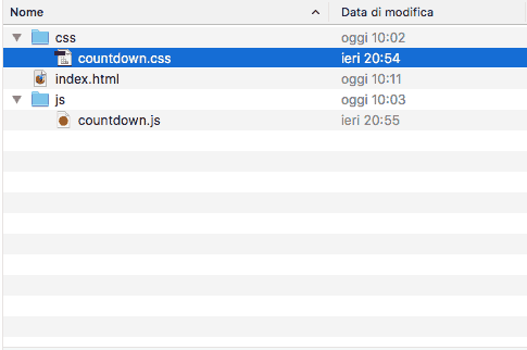
Potete organizzarvi meglio la struttura delle cartelle in questo modo :
Programmatore WordPress Esperto WooCommerce
Sono l’autore di questo blog con tanti trucchi e guide su WordPress e WooCommerce.


ciao, come faccio a fare in modo che il countdown finista per esempio il 30 settembre a partire da oggi?
suddiviso in giorni e ore